
Designing Emotion! | 매거진에 참여하세요
Designing Emotion!
#MotionDesi #UX #MicroInter #Emotional #Interface #Brand


The Subtle Power of Motion and Micro-Interactions in UX
When Emotions React Before Clicks
We've all felt it—when tapping a button triggers a satisfying bounce,
or when a screen transition flows so smoothly it almost feels like it's anticipating your next move.
These moments are more than just functional; they’re emotional.
In a world increasingly shaped by AI-driven interfaces, the ability to stir emotion is quickly becoming a key UX differentiator.
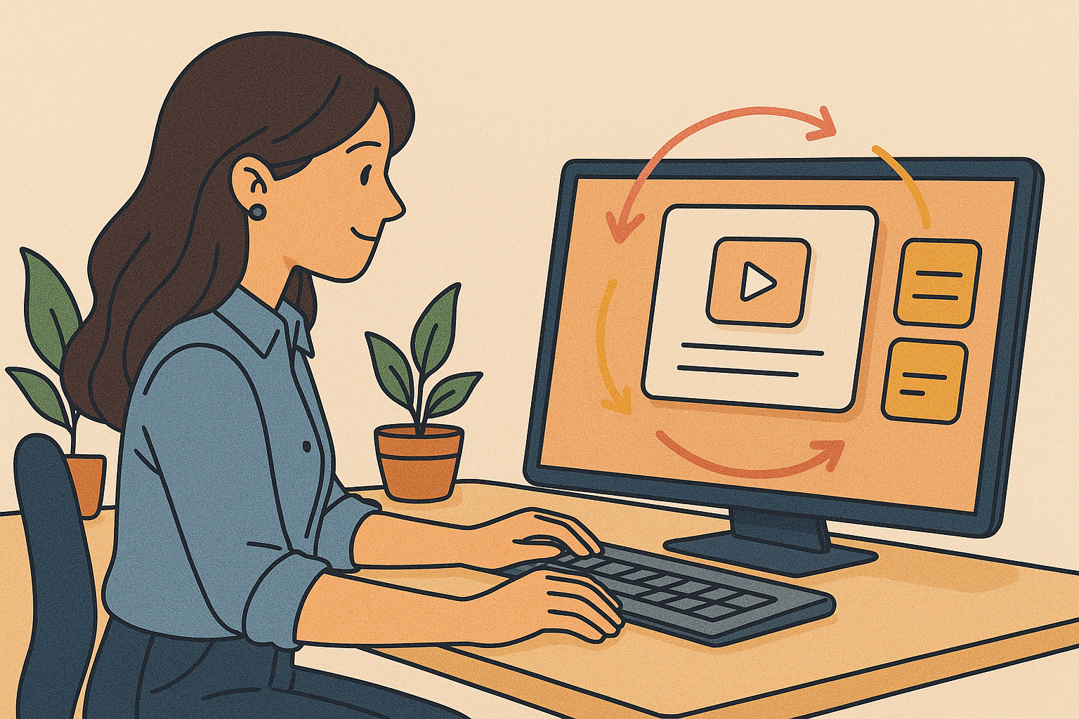
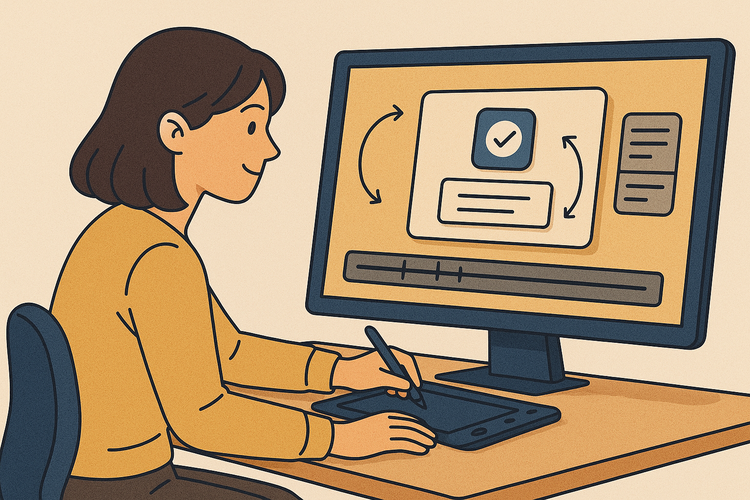
So, What Exactly Is Motion UX?
Motion UX goes far beyond “things that move on the screen.”
It’s the art of using motion at just the right time to communicate meaning, reinforce context, and—perhaps most importantly—evoke emotion.
Here’s how it plays out in real-world UI:
Element | Example |
|---|---|
Page Transition | Slide-in animation when navigating between screens |
Feedback Animation | A button that depresses and springs back on tap |
Loading Motion | Visual rhythm during waiting moments |
State Change Signal | Check mark for success, subtle shake for error |
Great motion doesn’t explain—it feels right. It’s design that persuades without speaking.
Why Motion Matters Now More Than Ever
In the age of Vision Pro, wearables, and voice interfaces, motion is being rediscovered—not as decoration, but as narrative.
- Complex user flows now need visual rhythm to guide attention
- Instantaneous feedback is expected, especially on mobile
- Brand differentiation often hinges on small emotional cues
Text-based UIs are reaching their limits. Motion steps in to bridge the gap between human emotion and machine logic.
Where Is the Line? Good vs. Overdone Motion
Motion is powerful—but also risky. Overuse leads to distraction, fatigue, and even user frustration. The key? Think micro.
Criteria | Good Motion | Bad Motion |
|---|---|---|
Speed | 200–300ms, smooth and responsive | 800ms+, slow and laggy |
Frequency | Reserved for key interactions | Applied on every page |
Purpose | Communicates, reinforces emotion | Decorative, show-offy |
The golden rule? The best motion feels invisible, but indispensable.
Tools Evolving with the Vision
Motion design tools are catching up to these UX needs:
Lottie (by Airbnb)
Lightweight, vector-based animations exported from After Effects
Perfect for app/web with real-time responsiveness
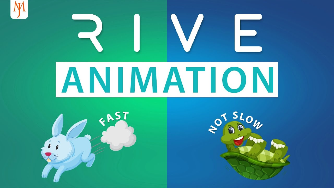
Rive
Interaction-centric animations with live state changes—no code required
Ideal for hover-to-click-to-success chains
Designing Emotion in AI Interfaces
AI-powered UX introduces ambiguity—no single “correct” flow. Motion steps in as a stabilizing force.
When users input a query:
→ A trio of bouncing dots suggests the AI is “thinking”When a response appears:
→ A speech bubble gently pops upward, signaling “done”
Motion humanizes AI. It doesn’t just convey progress—it gives that progress a personality.
Micro-Interactions: The Final Frontier of Brand Emotion
Why are brands investing so much in these tiny details?
Because in an era where features are easily copied, emotional resonance is the only real moat.
Think of:
- The blinking cursor in the Google search box
- Netflix’s rotating red N loading spinner
- Notion’s oh-so-satisfying checkmark animation
These moments linger in memory. The goal isn’t speed. It’s memorable speed.
In Closing: The Emotional Arc of a UX Designer
Motion UX isn’t a layer you slap on at the end. It’s the thread that binds function and feeling.
So, to every designer reading this: next time you're mapping a flow or prototyping a feature, pause and ask:
“Where is the user's emotion at this point?”
“How can I show feeling, not just function?”
That might just be where your best work begins.
Motion UX reference: bunzee.ai

- link_kakaolink_kakao_url
- link_operatorlink_operator_url
- link_investhelp@letspl.me
- link_ad_urllink_ad
